Data Visualization

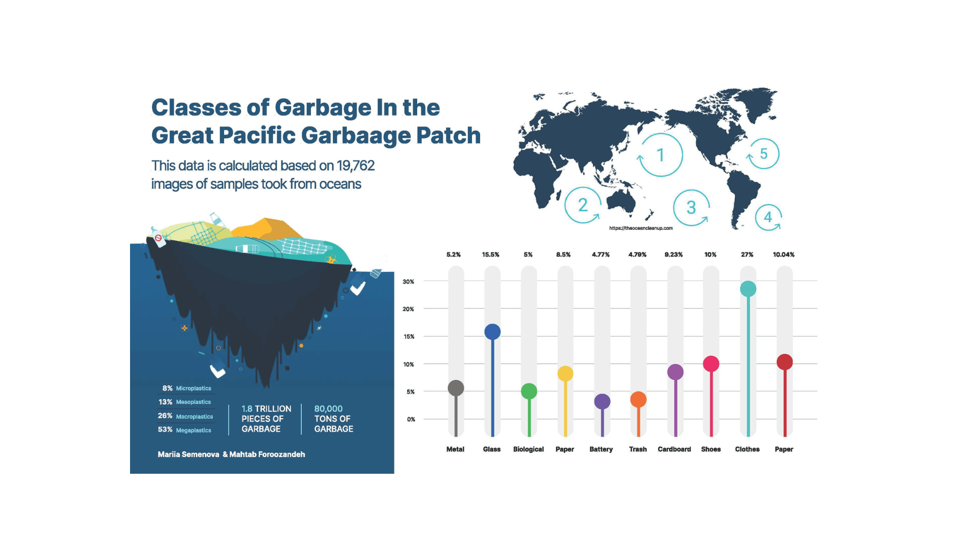
This category showcases projects where I transform raw datasets into engaging, story-driven visuals. From animating GPS journeys through 3D city maps to mapping ocean plastic accumulation with scientific data, these works combine data processing, spatial mapping, and visual storytelling to make complex information clear and impactful.

Mar 15, 2025

Company

School Project

Company

School Project

Company

School Project

Role

Designer

Role

Designer

Role

Designer

Service

Data Visualization

Service

Data Visualization

Service

Data Visualization

Purple Flower
Purple Flower
Purple Flower

Ocean of Garbage

Ocean of Garbage

Ocean of Garbage

Tools: TouchDesigner, Python

Process: Data Processing, Animation, Visual Mapping

This project explores how data visualization can be used to communicate the ecological scale and emotional weight of the Great Pacific Garbage Patch, a massive accumulation of marine debris spanning two of the world’s largest ocean gyres.

Rather than presenting the data through traditional bar charts or geographic maps, I aimed to create a conceptual and atmospheric visualization that reflects the overwhelming, fluid, and often invisible nature of ocean pollution.

Design Challenge
How might we visualize large-scale environmental data in a way that is not only informative but also emotionally resonant, helping audiences understand the magnitude and urgency of the issue?

Goal
To create a visual interpretation that blends data accuracy with poetic environmental storytelling, making the invisible visible.Screenshot of floating garbage in the oceans

Data Gathering

I worked with publicly available datasets and scientific summaries from:

  • The Ocean Cleanup Project

  • NOAA Marine Debris Program

  • Research papers on microplastic density and gyre movement

The data focused on:

  • Estimated size (1.6 million km²)

  • Microplastic concentration per square kilometer

  • Major categories of debris (fishing gear, consumer plastic, microplastics)

  • Distribution patterns within the North Pacific subtropical gyre

Understanding the Problem

The Garbage Patch is not a “solid island”, it’s an amorphous, constantly shifting accumulation of microplastics.
This misconception leads to misunderstanding about:

  • Its scale

  • Its danger

  • Its invisibility

Insight:
Traditional visuals fail because they depict the garbage patch as a fixed shape. The true form is diffuse, shifting, and difficult to comprehend.

Visual Inspiration

To reflect this fluidity, I drew inspiration from:

  • Ocean currents and turbulence maps

  • Drifting particles

  • Satellite imagery

  • Japanese ink gradients

  • Atmospheric data-viz styles

My goal was to communicate movement, density, and unease.

In addition, I designed an informational poster that breaks down the types of debris (e.g., fishing gear, consumer plastics, microplastics) and shows relative counts from the dataset, turning complex sampling data into a clear, shareable infographic for public audiences.

View the process book for more detail

Vancouver City Journey

Vancouver City Journey

Vancouver City Journey

Tools: TouchDesigner, Python

Process: Data Collection, Processing, & Visual Design

This project visualizes a GPS-tracked walk from Canada Place to the Vancouver Public Library on a 3D city map. Using TouchDesigner, I animated the path in real-time with dynamic color changes based on speed — green for slower movement, orange for faster. The city map was transformed into an interactive particle system, creating a living, responsive environment that reacts to the traveler’s movement.

The work involved:

  • Collecting GPS data with the Holonist app

  • Cleaning and restructuring the raw data using Python

  • Mapping coordinates into 3D space in TouchDesigner

  • Adding speed-based color mapping for better data storytelling

  • Converting a static city model into an animated particle system

The result is an immersive 3D visualization that combines spatial accuracy, interactivity, and motion-based storytelling to make location data more engaging and intuitive.

View the process book for more detail

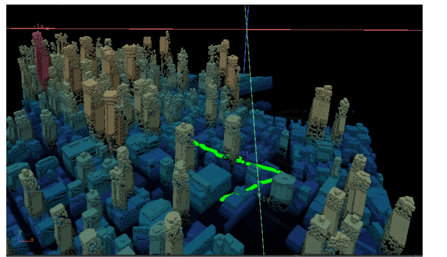
Screenshot of my movement in the city

Create a free website with Framer, the website builder loved by startups, designers and agencies.